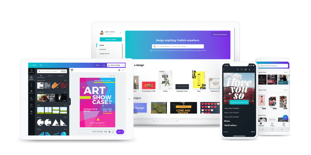
Project: I worked with two other students to conduct a usability test for Canva. The goals of the testing were to:
1. Compare the usability of desktop vs. mobile interface
2. Compare perceived usability of interface for designers vs. non-designers
3. Determine ease of use for posting to Facebook
Participants: We recruited 6 participants for our usability test. This number was consciously selected so that we could discover interface issues without being overloaded with information. Of the 6 participants, we recruited 3 participants with design experience and 3 participants with limited to no design experience so that we could compare Canva's perceived usability amongst two kinds of users.
Testing: The participants were given a before questionnaire to understand their design experience and their experience with Canva. Then we assigned them two tasks to be completed. One task required the user to create a design in Canva and post it to Facebook using the web interface and the other task required the user to create a second design and post it to Facebook using the mobile interface. We recorded the screens of each user to analyze later. We then provided each participant with another questionnaire to better understand how they felt about their experience.
Analyzing The Data: In order to understand the test better, we all sat down together and watched each participant's screen recording multiple times. We then created an affinity diagram to better visualize the different patterns throughout each process.
Conclusions: We were able to understand a lot through this testing. All of our participants had an easier time when creating on the web interface due to the size of the screen and better control over each design element. The majority of participants had a lot of difficulty editing text on the mobile interface due to the inability to select areas between letters. When comparing the perceived ease of use between designers and non-designers, we discovered that even though experiences were similar, designers perceived Canvas interface as too simplistic due to their experience with other design software. We also discovered that posting to social media was a much larger problem on the web interface. On mobile, it was one click and your post was good to go. On web, a user would have to download the picture, log in to social media, and post the picture via upload. Based on our findings we determined that there were two glaring issues with Canvas interface. We offered the following two design solutions to improve user experience:
1. Allow for a user to hold down an area in the text element to edit a direct spot of the text on mobile. A lot of users deleted whole words to fix a misspelled word because Canva did not allow for selecting between two letters
2. Create a post button on the web interface


